#light sensitive
Explore tagged Tumblr posts
Visit Tumblr Blog
Explore Tumblr blogs with no restrictions, modern design and the best experience.
Last Seen Tumblr Blogs


Fun Fact
In 2020, 44% of users from Denmark used Tumblr daily.
Text
"It's not that bright!" I will gaslight you into thinking you have cataracts. /j
2 notes
·
View notes
Text
Darcy would take my side it’s too bright in here…
#mr darcy#fitzwilliam darcy#autism#autistic#light sensitivity#light sensitive#eyesight#eye sensitivity#sensitive eyes#sight sensitivity#too bright#natural vs created light
0 notes
Text


Joachim Froese (b 1963) Canada, lives and works in Australia
Perseverance, Sol 693, Mars (2023)
UV sensitive unfixed salt print
exhibited: HOTA, Gold Coast
0 notes
Text
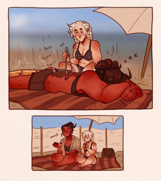


some beach babes i started while i was on holiday <3
#bg3#baldur's gate 3#tavstarion#shadowlach#tav#astarion#karlach#shadowheart#i like to think even after they sort out the daywalker thing he's still v light sensitive and crisps after 5 minutes#also the first one was funnier in my head#when in doubt use your tiefling gf as a barbecue#shart isn't made for swimming she's supposed to float on a lilo for 4 hours and that's it
11K notes
·
View notes
Text

✦ Siesta ✦
#own art#own characters#CanisAlbus#art#artists on tumblr#Vasco#Machete#sighthound#dogs#canine#animals#Vasco's golden fur looks it's best in direct sunlight#Machete prefers shade because he burns easily and his eyes are sensitive to bright lights#I love light yellow I see yellow and I go HRAAAH
17K notes
·
View notes
Text
hey STEB NATION (me and 5 other fish enthusiasts) how are we feeling

#do we think he needs sleep masks because his eyes are sensitive to light#do we think he's good at sewing things bc he's a medic#do we think he sleeps curled up bc idk bc my heart tells me so#we definitely do think he's selectively mute#arcane#steb arcane#arcane art#steb my love#steb x reader#viktor arcane#silco#jinx#steb#viktor x reader#monster fuqqer#hear me out#arcane fanart
7K notes
·
View notes
Text

#i’m sensitive#cute#girlblogging#just girly things#valentines day#coquette#coquette pink#girlblogging pink#pastel pink#pink aesthetic#pink blog#pink coquette#girly pink#soft pink#pinkcore#light pink#pink#red aesthetic#red#heart shaped#girly aesthetic#just girly thoughts#girly stuff#girlhood#just girly posts#girly girl#girly blog#girly tumblr
3K notes
·
View notes
Text
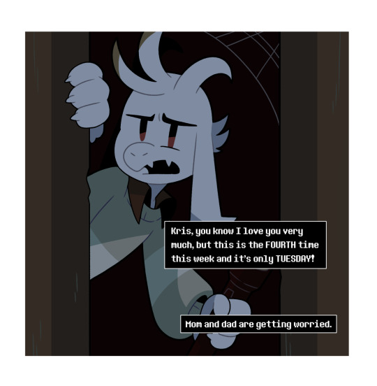


Just a regular day
#twin runes#twin runes mini#kris dreemurr#asriel#tw scopophobia#imagine living in the same house with what's basically a cryptid#that you adopted after you found them in a dumpster#this ties into the random TR!Kris facts post#so we got tight spaces... check#hypermobilty... check#glowing eyes/night vision... check#and light sensitivity... check
4K notes
·
View notes
Text
You are not alone in that. Display settings still confuse me despite hours and hours of research. I was just on the phone with tech support trying to figure out how to use my new color calibrator and trying to figure out if it was okay to use the "P3 color space."
Adjusting your screen should not be this hard.
I'm afraid a big part of the problem stems from a Japanese technology philosophy where they prioritize legacy features and old ways of doing things. Tradition is a very big deal in companies like Sony, Panasonic, and Toshiba and they were the biggest influences on how modern displays operate. And even though Samsung and LG have become the leading manufacturers, that traditional philosophy got sort of locked in.
This is especially true in the camera industry as well. Smartphones have reinvented how most people approach photography, but the Japanese camera companies refuse to evolve their approach with the bigger ILC cameras. The menus use a lot of outdated terminology. They refuse to use smartphone operating systems. They offer almost no image processing features. And transferring images usually requires pulling a little card out of the camera, sticking it into a USB reader, and copying everything to your computer drive. Whereas smartphones put everything on the cloud a second after the photo is taken.
TVs and displays have a lot of the same issues. They use a lot of legacy terminology and have confusing menus and they do a poor job of informing users how to configure their screens. Which is why a lot of folks just have to guess about which buttons to push or which settings to change.
Or there is a fear that if people change a setting, they might make things worse and won't know how to change it back.
The contrast setting made sense on a tube based television. It functioned more like the slider in a photo editing app. But when TVs went to LED tech, they were already tuned to be as contrasty as possible. So the contrast setting just ended up dimming the whites.
And many people aren't used to having a functional brightness setting. TVs used to be so dim, everyone just left it at 100%. Now displays are up to 10 times brighter (which is great for using in daylight) but no one is told how you are supposed to use the setting to match the ambient light.
It should be thought of more like a volume knob on a stereo. If the room is loud, you have to turn up the volume. If the room is quiet, turn it down.
If it were up to me, I would make display settings more like photo editing menus.

And contrast would go back to actually adjusting the contrast rather than how bright the whites are.
I'd change Exposure to Intensity, but otherwise these would be easy to understand adjustments any non-tech person could understand. And you could return every setting to 0 so you'd never have to worry about messing up your picture with a bad adjustment.
There is one way to get this kind of granular control over your image. But you have to obtain your content through... dubious means... and a VPN.
Or you can transfer your physical media to your computer.
There is a video player called "Media Player Classic." It is a powerful open source program that allows endless adjustments. It can be paired with an add-on called MadVR which gives you even more control and also has features that genuinely improve picture quality.
If you are willing to learn how to use these tools, you can custom craft how your video looks in just about any way you can imagine. You can cap the highlights at a certain brightness, you can warm the color temperature, you can boost the shadows. And you can apply your custom settings to any video you watch.
There is a steep learning curve, and there are some simpler adjustments that can do similar things in VLC player. But I think if people with particular eye sensitivities are looking for a way to get a decent image while accomodating their vision issues, this might be a helpful tool.
Reddit has a bunch of guides for how to setup MPC and MadVR. And by now there may be better alternatives. (People are making cool new shit all the time and it is hard to stay current). But I think that would be a good place to start if you are interested.
Let's talk about screens and eye comfort.
@krakenartificer wrote this in response to my motivated lighting post.
Maximum-visibility lighting is also accessible lighting. I cannot turn the brightness on my screen up any more than it is -- even a few seconds of a light-mode app at 75% brightness will give me a migraine. I believe you when you say that the train-light photos are legible to you. But with my screen at ~50% brightness in a medium-dim room, that second one, with the bright-white light, is already painful to look at. And since my pupils have constricted to protect me, I can't see almost anything else going on there.
I already mentioned that if people are having issues seeing dark elements in their content, their room may be too bright. That is a strategy to get the highest quality viewing experience, but it may not be the most comfortable for people with various eye sensitivities.
So I'm going to address eye comfort over image quality in this post.
I think many people have a misconception about the brightness setting on their display. Often people will turn it up and down depending on the content they are viewing. If something has a really bright element, they may turn it down. If something is too dark, they may turn it up.
That isn't really how display brightness is meant to work. This setting is meant to maintain picture quality and contrast as much as possible while raising and lowering the overall intensity of the display. And the intensity is meant to be adjusted according to the viewer's environment, not what is on the screen from moment to moment.
You want the intensity of light in the room to match the brightness of your screen.
Some people prefer to adjust their screen a little brighter than ambient so it is a little more legible. But that is a personal preference.
So if you are in a dark room, you'd turn the brightness down.
If you are out in bright sun, you'd turn your brightness up.
If your screen is displaying near white or pure white and it hurts your eyes, that usually means your room is too dark. A brighter ambient environment can help make "light mode" more comfortable. Try turning on some lights or going to a brighter space and see if it helps.
However, some people do not feel comfortable in brighter rooms. This is when you might consider "bias lighting." This is a soft light source behind your screen that you can adjust to the maximum tolerable brightness to keep your eyes from going into night vision mode or max dilation.

It's better if the bias lighting is spread out rather than using a small light source like a night light. Small light sources feel much more intense and can add to eye strain. You want the light to cover a large surface area.
String lights across a wall work well.

Or you can bounce a light off a wall or ceiling to diffuse and spread it out. Many people just put a light behind their TV and light up the wall behind it.

The idea is to make the room *feel* dark while still having enough light to keep your pupils from opening up and feeling like any sudden bright light source is blasting you in the eyeballs. Your pupils prefer gradual adjustments to light and dark. If you go straight from a dark scene to a bright scene without any bias lighting, your eyes might feel a bit melty.
If you are *still* uncomfortable with white on your screen and have a particularly strong eye sensitivity, then you might consider sacrificing picture quality for comfort.
Turning down your brightness is not a great solution because it makes *everything* darker. Again, the brightness of your screen should be close to the room lighting.
Typically, to get the highest quality image you want to adjust your screen so the blacks are as black as possible and the whites are as white as possible without losing any detail.
Rtings has a guide for monitors and TVs for this.
They have two patterns for black and white point adjustment.
They look like this.

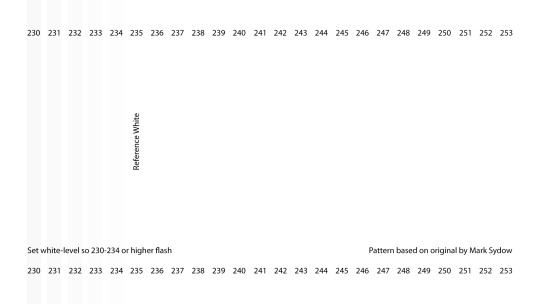
You want to see bars all the way up until the reference point.
The white point is most commonly called "contrast" in display settings. Sometimes there will be a contrast adjustment AND a white point adjustment. In that case, the white point only deals with the brightest highlights and the contrast will affect all whites.
But if you have really sensitive eyes... forget the charts. Forget peak image quality.
Instead, try lowering your contrast and reducing the intensity of *only* the white elements rather than darkening everything.
The picture might look a little gray and dull, but you won't lose as much legibility in the shadow areas. You are just turning down the brightest stuff to make your eyes more comfy.
Max white point...

Lowered white point...

And if you still need to turn down your screen brightness, you can raise the black point to keep more detail in the shadows.
Again, that might not look great, but it will keep your eyes comfortable and you will be able to make out all the details you need to see.
You might also consider adjusting the color temperature of your screen to be warmer. Blue light is higher frequency and more energetic. Which means it can pierce and glare more than warmer light. So shifting things to the orange could also bring some comfort to sensitive eyes. Search for a “Warm” mode, “Eye Comfort” mode, or Night Shift settings.
Most TVs and monitors have these adjustments. Sometimes they call them different things, so you may have to do some googling. (God forbid tech companies ever agree on a standard.)
And if you are on a phone or laptop, you may need a special app to adjust these specific things. I would research "how to reduce white point" for whatever device you are using.
To review...
Adjust your ambient room lighting first. Brighter ambient room lighting can make bright white elements on your display more comfortable.
Display "brightness" should be adjusted to your lighting environment, not the content on screen.
If you don't like bright rooms, bias lighting behind your display can keep your eyes from going into night vision mode. This can prevent bright screen elements from being too intense or glaring.
If you have eye sensitivity issues, try all of the above first, and then consider lowering your contrast or white point setting. This will dim only the brightest elements on screen without making everything else too dark.
If you need to lower the screen brightness AND white point/contrast, you may lose detail in the shadows as well. You can try raising the black point to compensate. This is a worst case scenario and will probably not look great.
Consider warmer color temperature settings to reduce glare from high-frequency blue light.
321 notes
·
View notes
Text
This environment is incredibly hostile to a creature such as myself (there are fluorescent lights)
#bright lights#my eyes burn#help#i want to be in the darkness#cryptidcore#gremlincore#crowcore#witchcore#mosscore#chaoscore#chaotic bastard#shitposting#shitpost#autism humor#autistic#autism#light sensitivity#sensory issues#sensory overstimulation#sensory overload#im overstimulated#bastardcore#haha funny
11K notes
·
View notes
Text

The grey man
-
@ladywraith , as promised
#artists on tumblr#star wars fanart#fan art#star wars: the clone wars#commander cody#post order 66#Temuera Morrison reference used#Temuera Morrison#do not question this lighting it is sensitive to questions you will make it cry
1K notes
·
View notes
Note
STOOOP THE SMC KISSING DREAMWEAVER!YNS ANTENNA'S WAS ADORABLE WHAT??
What would happen if shadow milk kept kissing the wings and/or antennas🤭

I think they also liked it a lot
The aftermath:

#cookie run kingdom#crk#my art#my artwork#dreamweaver au#crk au#shadow milk cookie#cookie run au#crk dreamweaver au#crk x reader#cr kingdom#cr x reader#shadow milk#shadow milk cookie x reader#shadow milk cookie crk#shadow milk x reader#cookie run x reader#cr au#even their wings are now propelling 😭#enough energy to light up entire cities#reminder: that the antennas and wings are highly sensitive so :] do what you will with that#even their whiskers(??) are slightly vibrating thats crazy
310 notes
·
View notes
Text
This might seem like an "old man yells at cloud" situation, but it's just wild growing up and being told how dangerous distracted driving is - how, at highway speeds, you can traverse the length of a football field (100 yards, 91 meters) in a matter of seconds - how one split second sending a text while driving could result in a potential fatal crash, and then getting on the road as a driver and being surrounded by billboards. Their entire purpose is to catch one's attention, so they're lining major roads, which tend to be highways. How is it that you're told how important it is to never be distracted while driving, but still being advertised to?
At best, this type of advertising is an eyesore to pedestrians and motorists and a general waste of electricity to light it, and at worst, it is an active danger considering they are there to advertise and therefore, must catch people's attention.
I'm not even against advertising in theory, but this particular mode bothers me so much and I hate how pervasive it is - especially in large cities or highways.
#politics#i don't know much about são paulo banning marketing billboards but on paper i want that here in the USA#as a motorist it at best just makes me more anxious driving in those larger cities because i want to FOCUS ON THE ROAD#and passing 5000 billboards per mile isn't helping actually!#i've gotten good at filtering that out of my FOV but it's still fucking exhausting lol#i especially hate those modern electric billboards. despise them actually#i am aware that advertising is a critical aspect to business management in some cases...#...but it shouldn't risk the safety of the populous for you to advertise to them and i see things like billboards as risking safety...#...i feel similarly about online advertising in that so much of it risks internet user's safety...#...such as flashing ads online which risk triggering epileptic seizures in light/photo-sensitive folks#distracted driving (texting): NO >:( || distracted driving (being advertised to): YAYYYY :D#i've been driving on my own for a few years now and i've been thinking about this for ENTIRELY too long
4K notes
·
View notes
Text
sacrifice
day 3 souyo week '24 @souyoweek2020
#persona 4#yosuke hanamura#yosuke#souyo#spoilers#for true ending :3#hmm i think this piece might be too dark...light sensitivity messing up stuff again grrrr#already broke the don't draw just yosuke lol#used refs for the hands
1K notes
·
View notes
Note
saw your last post! you should draw them both wearing the scarves.
headscarf and bitch sunglasses just scream Machete
I don't know about scarves, but this might be an apt time to share these doodles I made last summer, of him in bitch sunglasses and a great big hat.

#the problem is that if I put sunglasses on him he instanty turns into a beatnik#and since he has albinism and his eyes are sensitive to light sunglasses are a necessity#own art#own characters#CanisAlbus#Machete#art#artists on tumblr#modern au#pants waist so high it has left the hip jurisdiction entirely and is inching towards his armpits#I don't know if it's just me but if you look at the outfit on the right from a distance it almost gives him sort of a priestly silhouette#which wasn't intentional but I thought it was funny
3K notes
·
View notes
Text


Today a fly zoomed straight into my mouth and got stuck in my throat but that's just how the springtime cookie crumbles innit. Please enjoy a pretty little crab spider skulking in some Azure Bluets, a Sensitive Fern frond cupping the sun, a patch of Red Columbine, a Veery, a Morel (!), Blue-bead Lilies, a Jack-in-the-Pulpit, and a pair of beetles in a Hawthorn flower cluster.
#hot today but the lighting in the woods was so good.....#arachnids#spiders#crab spider#plants#sensitive fern#red columbine#blue bead lily#jack in the pulpit#azure bluet#birds#veery#nature#forest#flowers#spring#new england#original photography#mine
263 notes
·
View notes